รั้วตาข่ายเทวดา มินิ ถี่พิเศษ 4x4

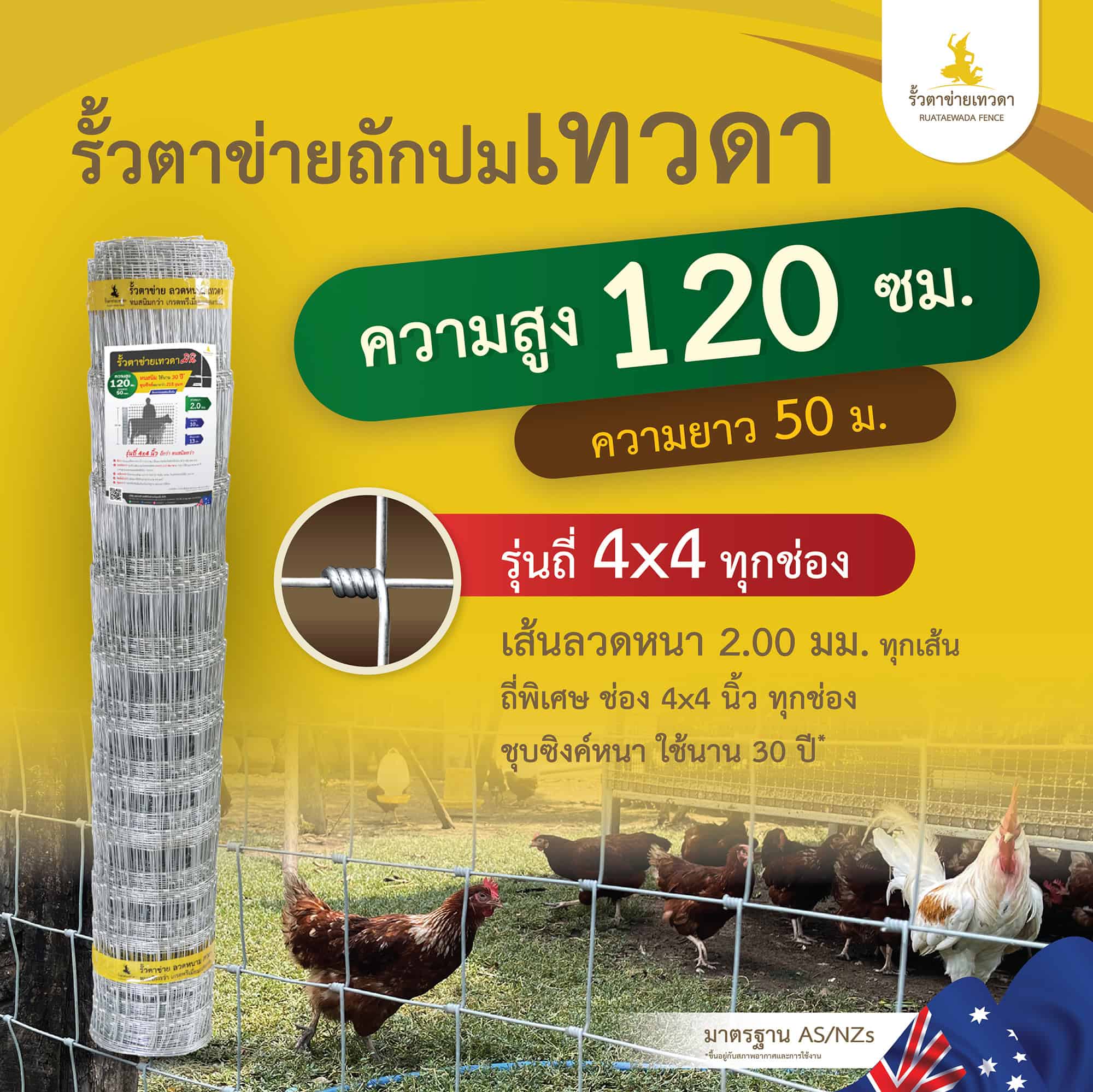
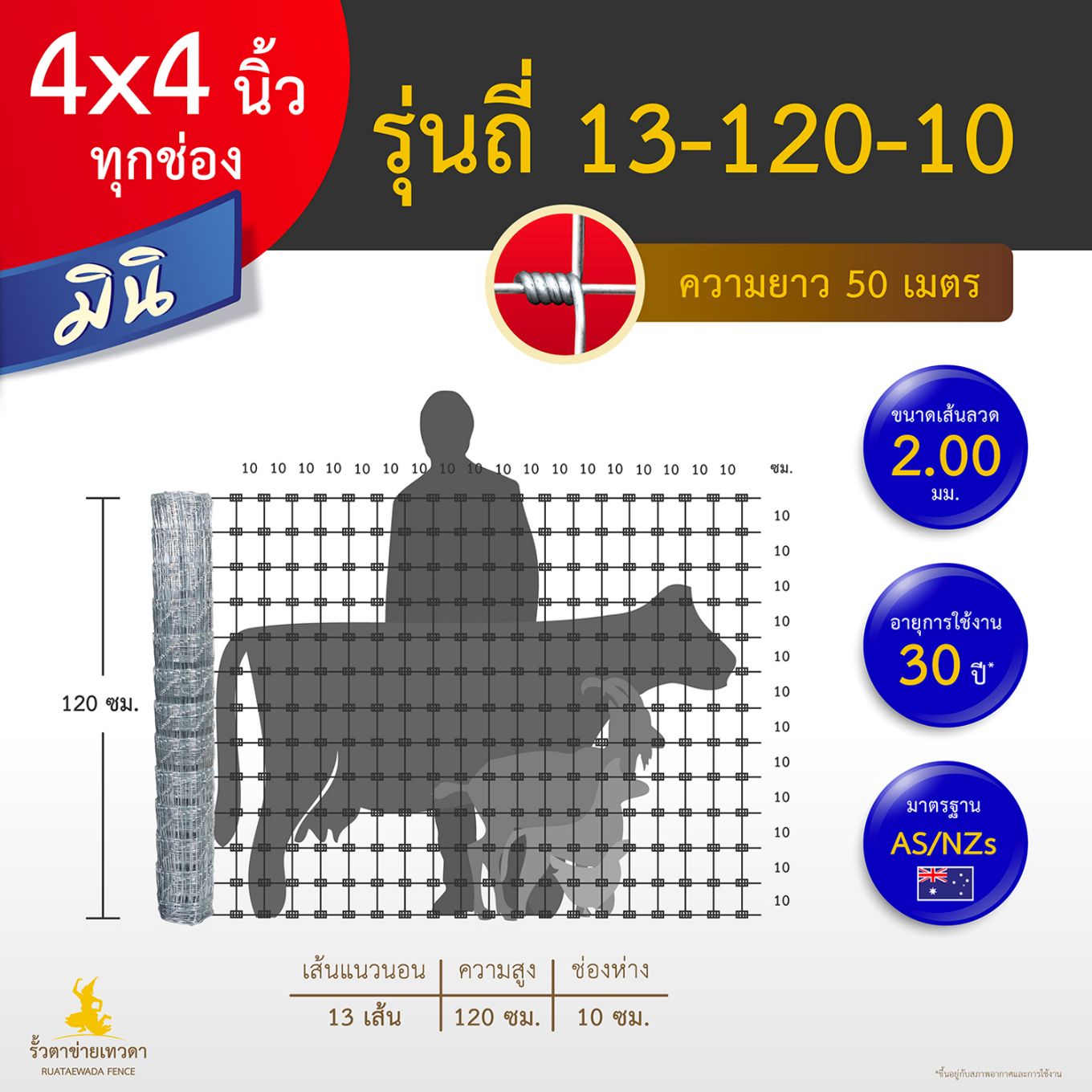
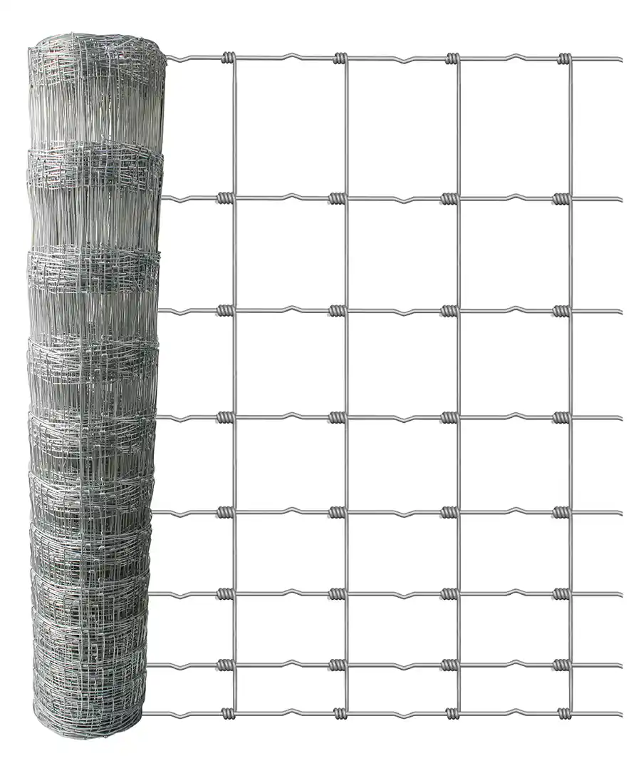
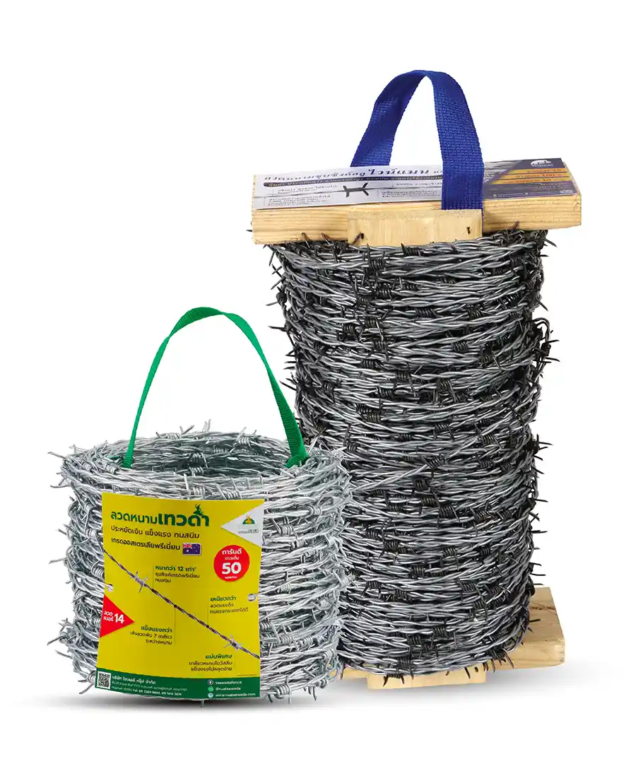
รั้วตาข่ายถักปมเทวดา มินิ – ความสูง 120 เซนติเมตร ลวดหนา 2.0 มม.(ยาว 50 เมตร) ช่องห่าง 10 ซม. รุ่นถี่ 4×4 นิ้วทุกช่อง [อายุใช้งาน 30 ปี*]

฿3,200
รั้วตาข่ายถักปม มินิ รั้วเทวดา ด้วยช่องตาขนาด 4″x4″ ซึ่งเป็นรุ่นที่มีความถี่ที่สุด ความสูงรั้ว 120 ซม. ขนาดลวด 2.00 มม. ทุกเส้น ราคาประหยัด เป็นรั้วตาข่ายเทวดา รุ่นถี่สุด ช่องห่างขนาด 4×4 นิ้วทุกช่อง หรือ ช่องแนวตั้ง 10×10 ซม. เหมาะสำหรับการกั้นสัตว์เลี้ยง 
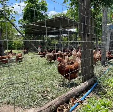
เอาใจคนชอบเลี้ยงสัตว์ สัตว์เล็ก สัตว์ใหญ่ ตอบโจทย์ทุกการใช้งาน โดยเฉพาะล้อมรั้วแพะ หัวแพะไม่ติดช่องตาข่าย นอกจากล้อมรั้วแพะแล้ว ยังสามารถล้อมสัตว์เล็กอื่นได้ๆ ไม่ว่าจะ ล้อมไก่ ล้อมเป็ด สุนัข ตอบโจทย์การใช้งานได้มากยิ่งขึ้น 
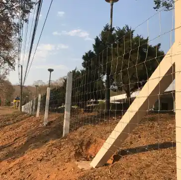
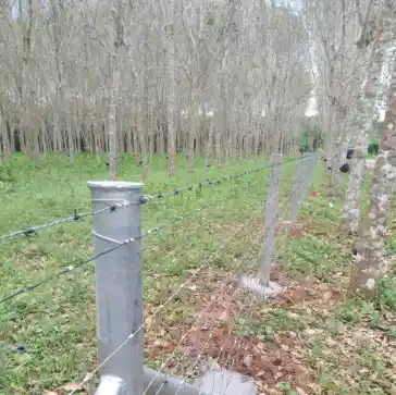
ป้องกันได้อย่างแน่นหนาเพิ่มขึ้น แข็งแรง ทนทาน ใช้งานได้ยาวนาน 30 ปี* สามารถใช้งานได้หลากหลาย เหมาะสำหรับไปใช้งาน

Online store of household appliances and electronics

Then the question arises: where’s the content? Not there yet? That’s not so bad, there’s dummy copy to the rescue. But worse, what if the fish doesn’t fit in the can, the foot’s to big for the boot? Or to small? To short sentences, to many headings, images too large for the proposed design, or too small, or they fit in but it looks iffy for reasons.

A client that’s unhappy for a reason is a problem, a client that’s unhappy though he or her can’t quite put a finger on it is worse. Chances are there wasn’t collaboration, communication, and checkpoints, there wasn’t a process agreed upon or specified with the granularity required. It’s content strategy gone awry right from the start. If that’s what you think how bout the other way around? How can you evaluate content without design? No typography, no colors, no layout, no styles, all those things that convey the important signals that go beyond the mere textual, hierarchies of information, weight, emphasis, oblique stresses, priorities, all those subtle cues that also have visual and emotional appeal to the reader.